
Font Pairing 101: The Rules That Make Fonts Work Together (Short Guide)
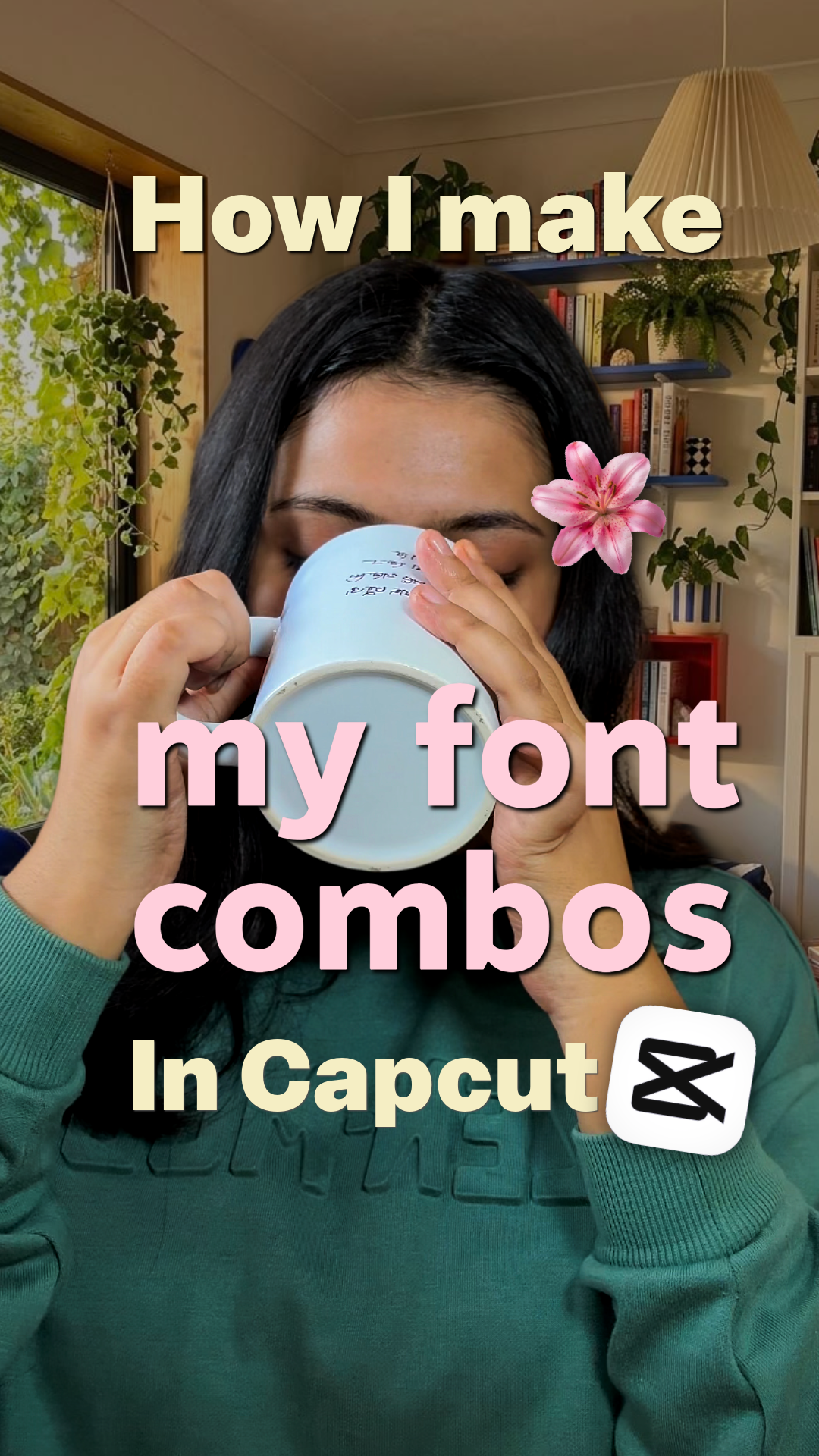
About this product
A beginner’s guide to help you understand the basics of creating font combinations that actually look good together.
Inside, you’ll learn: Create contrast — Pair fonts with noticeable differences. Build hierarchy — Give each font a clear role. Balance weights — Mix bold, regular and lighter weights intentionally. Mix styles carefully — Combine serif, sans serif or display fonts without clashing. Watch proportions — Make sure your fonts feel balanced in size and scale. Prioritise readability — Aesthetic doesn’t mean difficult to read.
A quick reference for content creators and designers who want better-looking typography without overthinking every font choice.
What you get

Onyx Social Studio
Founding Creator@sociallyonyx
I help creators and brands make their socials feel like them by providing ideas, strategy and resources ♡ Now, I have started off as a creator myself. Building @sociallyonyx from scratch in public ☆ Get freebies, 101 courses, templates and creator kits Let’s work together! 💌

incl. GST · digital download
Say thanksOnyx Social Studio
Founding Creator@sociallyonyx
I help creators and brands make their socials feel like them by providing ideas, strategy and resources ♡ Now, I have started off as a creator myself. Building @sociallyonyx from scratch in public ☆ Get freebies, 101 courses, templates and creator kits Let’s work together! 💌